We've rebranded and here's why
29 Aug 2021
We've come a long way since R&M was founded back in 1982.
Over the years we've evolved as a business, taking on new and exciting projects, expanding the team and growing our services. We're fast approaching our 40th birthday and felt some changes were needed to update our image. Keeping in line with our core values we wanted a fresh logo and brand personality that was much more consistent, memorable and modern.
Introducing our new logo
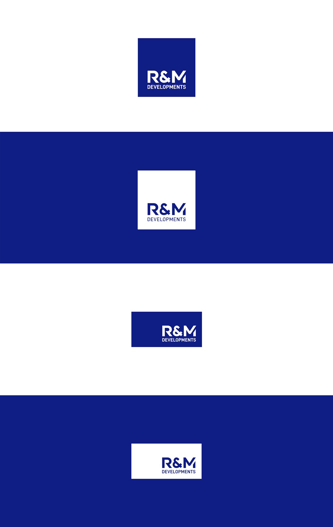
Our new logo comes with the option of both portrait and landscape layouts so depending on where our logo will be placed we can ensure it's clear.
Our brand colours
Since our inception the primary colour usage of R&M Developments has always been blue, our previous logo introduced more lime greens and softer blues, however with our new logo we wanted to make sure blue was the primary colour within our brand. We've introduced a new tone of blue that catches the eye and allows us to be seen. Alongside the blue we have the option to incorpoate the use of grey and white to keep things clean.
Whats next?
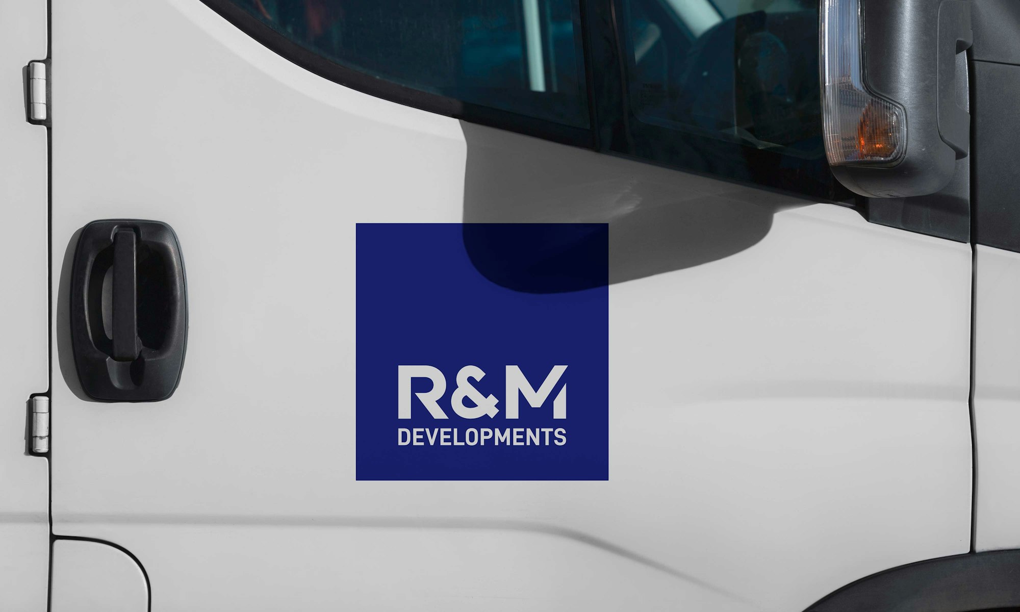
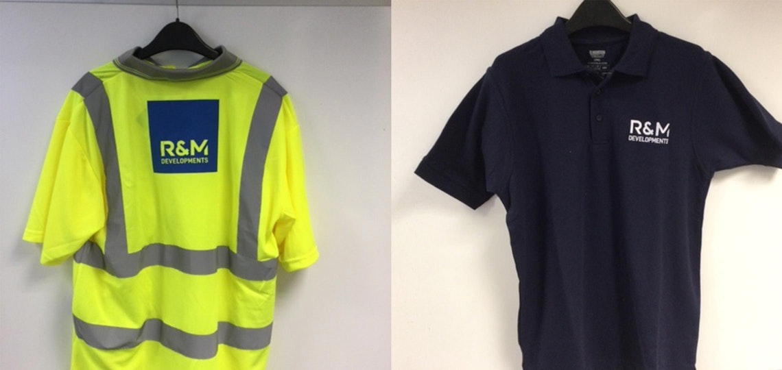
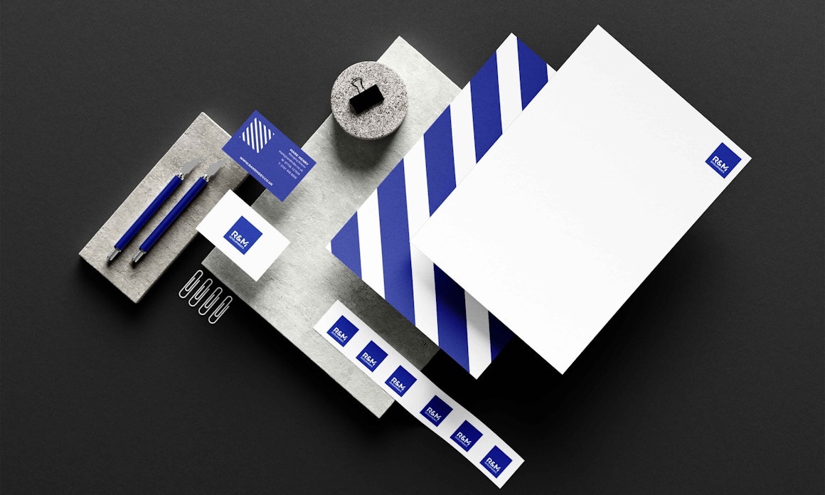
We've already started rolling out or new branding across the business. This has included updating our business stationery, e-mail signatures, staff uniform, vehicle branding and other areas to ensure our new logo replaces the old as we move forward.
